
Typography Best Practices for Outdoor Signs
Typography forms the backbone of effective outdoor signage, ensuring messages cut through visual noise to deliver clear, impactful communication. Proper font choices, sizing, and spacing make signs legible from afar, even under harsh sunlight or at high speeds.
In Pakistan's vibrant markets and highways, SignCraft stands as the top SMD screen and LED display services provider, integrating these principles into durable, high-visibility signs that boost business presence.
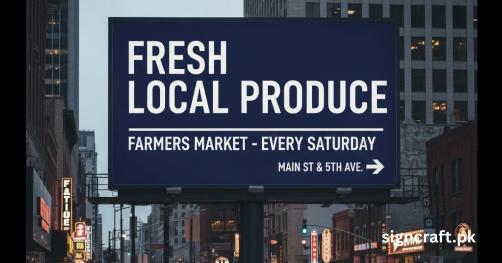
Understanding Typography in Outdoor Contexts: Outdoor typography must combat distance, weather, and distractions unlike indoor designs. Key goals include instant readability—viewers process signs in 3-5 seconds while driving or walking—and hierarchy, guiding eyes from brand to call-to-action. Sans-serif fonts dominate due to clean lines that resist distortion at scale.
Need Professional Outdoor Signage Design?
SignCraft combines typography expertise with premium LED technology to create signs that get noticed. Contact us for a free consultation!
Contact Us Call: +92 300 8599612 WhatsApp UsCore Principles of Readable Outdoor Typography
Effective typography follows foundational rules tailored to exteriors:
- Legibility First: Prioritize fonts with distinct letterforms—avoid scripts or overly stylized serifs that blur at 50+ feet.
- Contrast Mastery: Pair light text on dark backgrounds (or vice versa) for 70%+ difference; test in sunlight.
- Simplicity Rules: Limit to 2-3 fonts; one bold header, one clean body.
- Negative Space: Allocate 40% white space to prevent crowding, enhancing focus.
- Kerning and Tracking: Adjust letter spacing evenly—loose for highways, tight for pedestrian signs.
These create "thumb-stopping" signs that convert passersby into customers.
Best Font Families for Outdoor Signs
Select fonts proven for distance and durability. Here's a curated table:
| Font Family | Type | Strengths | Ideal Use Cases | Readability Distance (ft) |
|---|---|---|---|---|
| Helvetica/Arial | Sans-Serif | Clean, scalable, neutral | Business fronts, billboards | 100+ |
| Futura | Geometric Sans | Modern, bold geometric forms | Retail, tech stores | 80-120 |
| Bodoni | Serif (Bold) | Dramatic contrast, elegant | Luxury brands, restaurants | 50-100 |
| Impact | Block Sans | Ultra-bold, high impact | Directional, sales promotions | 150+ |
| Franklin Gothic | Grotesque | Versatile, strong presence | Directional, real estate | 75-110 |
Avoid: Thin serifs like Times New Roman or cursive fonts—they vanish outdoors. SignCraft recommends Helvetica pairings for LED signs, ensuring pixel-perfect rendering.
Optimal Sizing and Scaling Guidelines
Font size scales with viewing distance; use the "1-inch per 10 feet" rule as baseline.
| Viewing Distance | Header Size (inches) | Body Text Size (inches) | Example Application |
|---|---|---|---|
| 10-50 ft | 4-8 | 2-4 | Storefront pedestrian |
| 50-100 ft | 8-16 | 4-8 | Parking lots, malls |
| 100-300 ft | 16-48 | 8-16 | Highways, stadiums |
| 300+ ft | 48+ | N/A | Billboards |
Adjust +20% for curves or angles. SignCraft's custom calculators factor speed—75 km/h roads need 1.5x sizing.
Color and Contrast Best Practices
Colors amplify typography but demand outdoor-proof palettes.
| Background | Text Color | Contrast Ratio | Best Conditions |
|---|---|---|---|
| White | Black/Deep Blue | 21:1 | Daytime, high traffic |
| Black | Yellow/White | 18:1 | Night, highways |
| Dark Gray | Bright Red | 12:1 | Overcast, urban |
| Yellow | Black | 15:1 | Construction, warnings |
Pro Tip: Avoid blue-on-black (low contrast) or red-green (colorblind issues). SignCraft's SMD screens auto-adjust contrast via sensors for optimal visibility.
Common Typography Mistakes to Avoid
Pitfalls derail even premium designs. Learn what to avoid:
| Mistake | Issue | Fix |
|---|---|---|
| Too Many Fonts | Cluttered chaos | Stick to 2 max |
| Thin/Decorative Fonts | Invisible at distance | Bold sans-serif only |
| Low Contrast | Washed out in light | 70%+ ratio, test outdoors |
| Overcrowded Text | Cognitive overload | 40% negative space |
| Inconsistent Sizing | Weak hierarchy | Scale rule adherence |
Script fonts suit weddings, not commerce—save for accents only.
✅ Do This
- Use bold, simple sans-serif fonts
- Maintain high color contrast
- Follow sizing guidelines for distance
- Keep messaging concise
- Test in actual conditions
❌ Avoid This
- Using multiple fancy fonts
- Low contrast color combinations
- Too small text for viewing distance
- Crowding the sign with text
- Assuming indoor rules apply outdoors
Integrating Typography with Modern LED Signs
LED elevates static type to dynamic: scrolling tickers, animations, color shifts. Best practices include:
- Font Compatibility: Vector-scalable; avoid anti-aliasing artifacts.
- Refresh Rate: 1920Hz+ for blur-free motion.
- Content Rotation: 7-10s cycles to sustain attention.
- Accessibility: High-contrast modes, large text for elders.
SignCraft pioneers SMD LED signs with Urdu/English bilingual typography, perfect for Pakistani bazaars and commercial districts.
Testing and Validation Methods
Always validate before installation:
- Distance Test: Print mockups; view from target distances.
- Lighting Simulation: Day/night, shade/sun trials.
- Speed Mock: Drive-by at venue speed.
- Audience Feedback: Survey passersby on recall.
- Software Tools: Adobe tools or SignCraft's simulators predict performance.
Field data shows tested signs lift customer inquiries by 25% or more.
Related Articles
Ready to Create High-Impact Outdoor Signage?
From storefronts to highway billboards, our typography expertise ensures your message is clear, readable, and compelling.
Call or WhatsApp: +92 300 8599612
Get Free Consultation Explore Our Services